Designing the Logan Street Theater Identity
Most brands are built to stand out.
Distinct. Memorable. Attention-seeking.
But some identities shouldn’t try to stand out.
They need to feel like they belong.
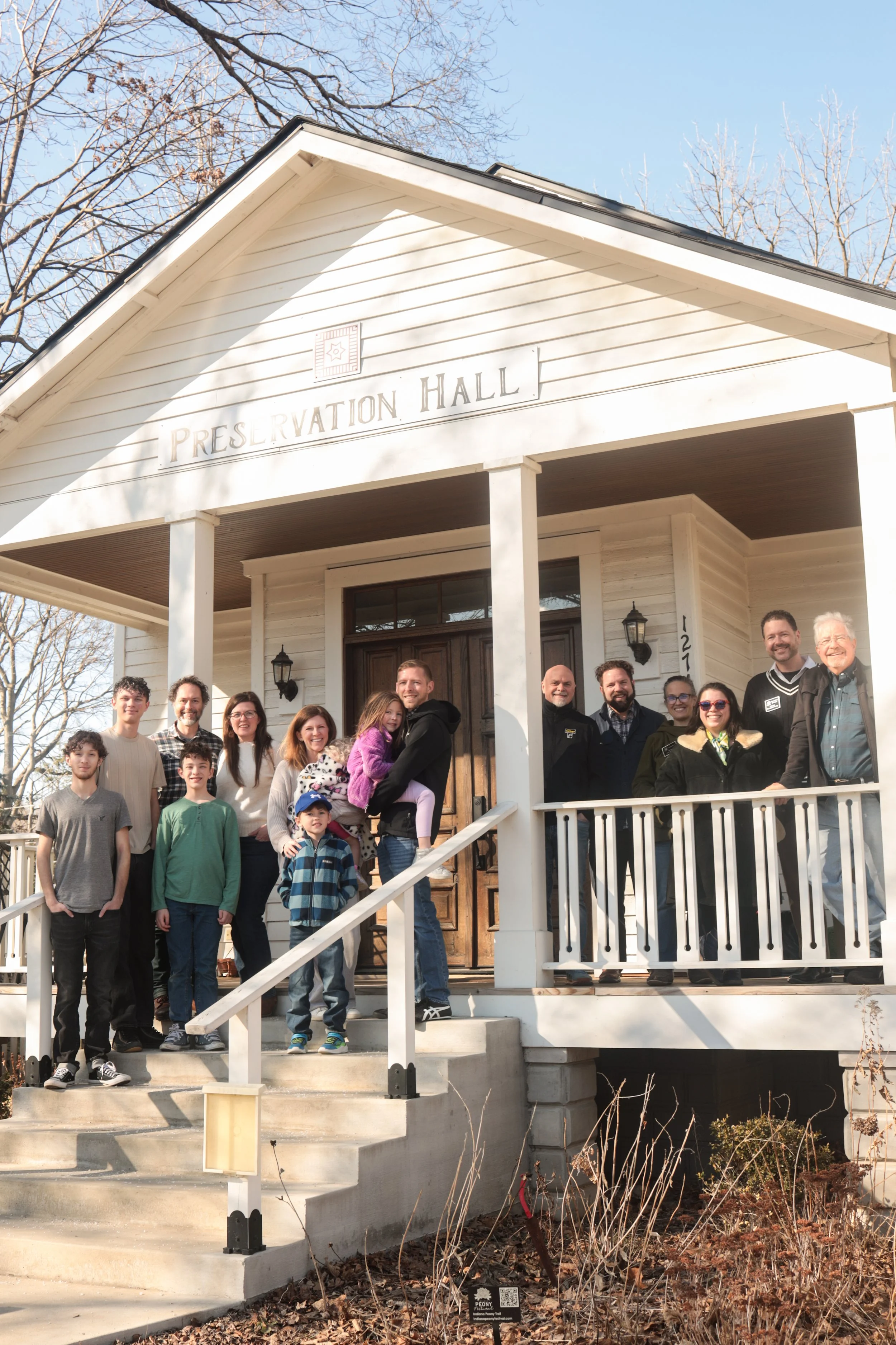
In early 2026, Zach and I, along with our families, purchased the historic building at 1274 Logan St., Noblesville, marking a new chapter for the longtime community arts space.
When we began imagining the future of that space, we weren’t just thinking about programming or renovations. We started with identity.
What kind of place should this be?
A polished arts institution?
A nostalgic throwback?
A modern creative venue?
In the end, the answer felt simpler — and more meaningful.
It should feel like a place that has always belonged to the neighborhood, even if it’s entering a new chapter.
The logo and brand became an opportunity to tell that story.
Not loudly.
Not with gimmicky retro styling.
But with quiet details that reference the building, the street, and the history of theaters as cultural gathering places.
What follows is a closer look at how those elements came together as I worked through the design process. It’s a slight detour from my typical Juxtaposts, but one that still reflects the same search for balance.
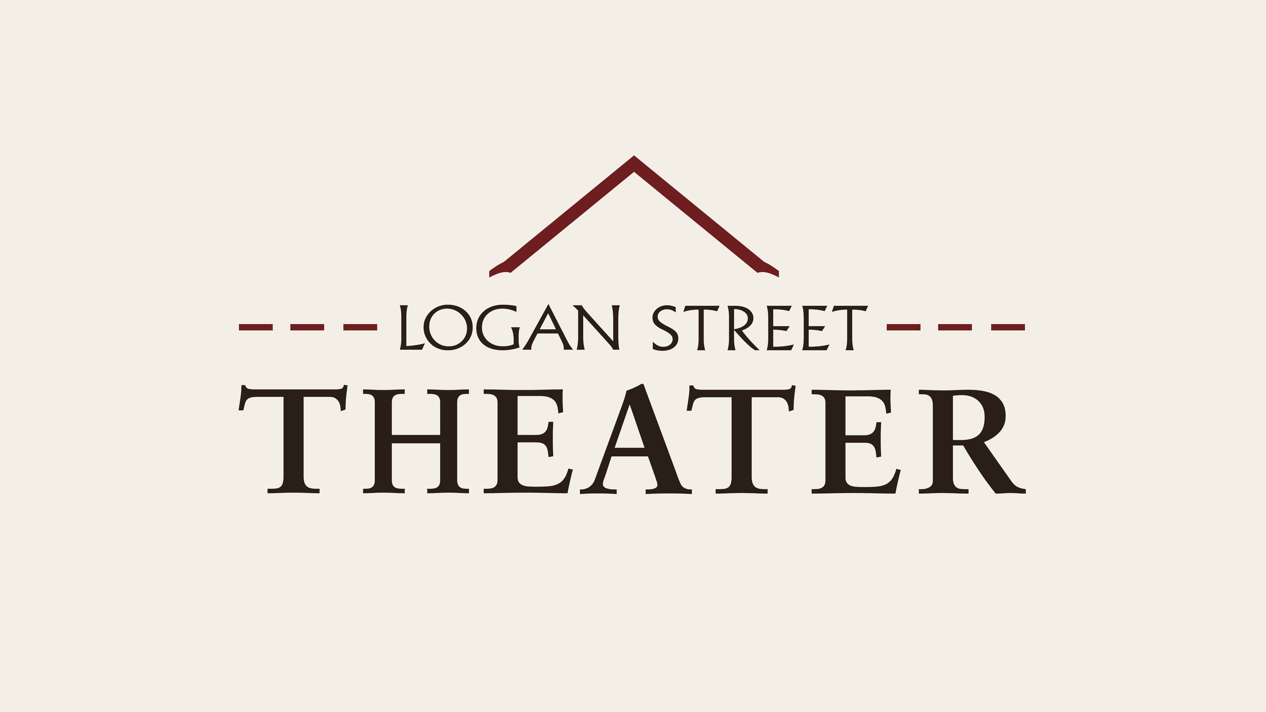
A Name Rooted in Place
From the beginning, one decision felt abundantly clear and required no debate.
The theater wouldn’t be branded with an abstract or invented name. Instead, it would lean into its geographic identity:
Logan Street Theater.
There’s something timeless about places named after their streets or the communities they belong to.
You see it in well-known places like:
Pike Place Market
Abbey Road Studios
And you see it just as clearly in theaters that are closely tied to their neighborhoods:
The Logan Theatre (Logan Square, Chicago)
The Castro Theatre (Castro District, San Francisco)
The Fowler Theatre (Fowler, Indiana)
The name immediately tells you two things:
Where it is.
What it is.
And in a neighborhood setting, that matters. The goal isn’t to feel like a global brand — it’s to feel like a local landmark. Which is a good thing since we live in a world with another Logan Theatre in Chicago and even The Indiana Theater in Indiana, Pennsylvania.
A Logo Emerged, Not Assigned
One of the guiding ideas behind the design was that Logan Street Theater is not just a concept or a brand — it’s a physical place.
It sits on a specific street, inside a historic building, surrounded by architecture, brick patterns, and a neighborhood people move through every day.
The identity was crafted to reflect that reality.
Instead of abstract icons or trendy graphics, the logo draws from elements you encounter when you visit the theater:
the gable roofline of the building
the decorative brick patterns nearby
the historic brick street outside
the architectural proportions of traditional theater signage
The goal was for the mark to feel less like a digital logo and more like something that belongs to the building itself — something that feels like it emerged from the place, not applied to it afterward.
The Peak: Architecture as Symbol
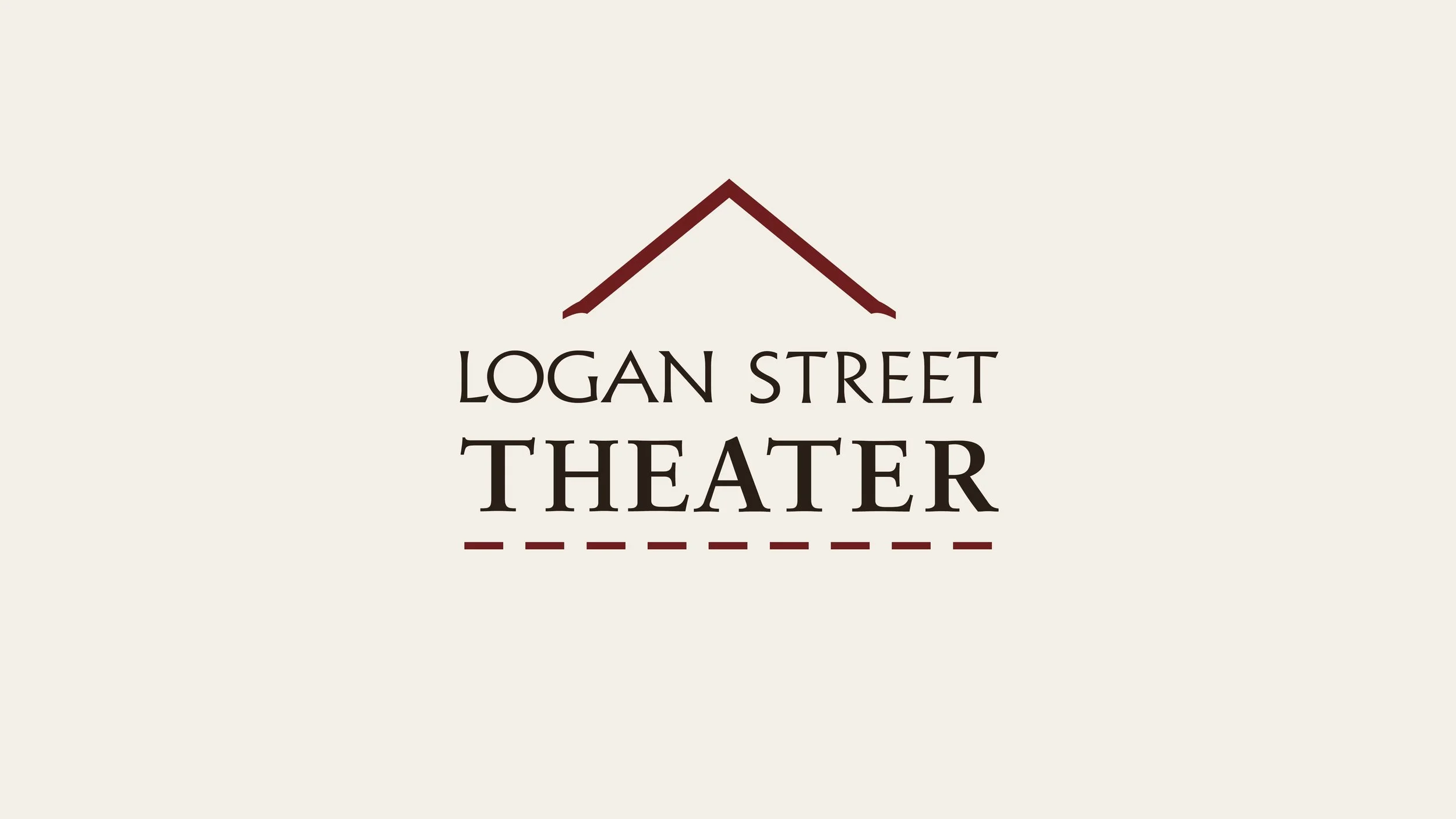
The most recognizable symbol in the logo is the small triangular shape above the text.
At first glance, it looks simple — just two lines meeting at a peak.
But it carries multiple references.
The Theater’s Porch Gable
The building itself features a distinctive gabled porch roof and congruent peaked roof extending straight from the front to the back with no diversions. That simple architectural shape became a natural starting point for the logo.
A single gesture:
^
The design distills the building into its most recognizable silhouette.
The Star Brick Motif
The peak also references a geometric detail found in the historic brickwork surrounding the building in both a physical and historical sense — a triangular element embedded in the decorative star brick pattern beloved by Noblesville residents and even used in other brand identities including the Noblesville Preservation Alliance (who previously owned and operated out of this building) and even the City of Noblesville.

The peak of the star shape helped inspire the proportions of the symbol.
The final result is a compromise between:
the actual porch roofline
the triangular geometry of the star brick design
The symbol isn’t a literal illustration of either — it’s a reverent nod to both.
A Hint of Historic Ornament
Look closely at the ends of the peak.
They’re not simple straight cuts.
Instead, the tips flare slightly outward.
These small terminals were added intentionally to echo the flared strokes in the lettering below. The effect is subtle, but it gives the roofline a touch of historic ornament — similar to the decorative ironwork or trim often found on early 20th-century theater facades.
It’s only a small detail, but it helps the symbol feel less like a geometric icon and more like something architectural and, perhaps most importantly, connected to the typeface.
A Typeface to Pay Homage
While much of the identity draws from the building itself, another influence came from a theater that once operated just down the street.
Historic photos of the original Logan Theater show a vertical blade sign extending out over the sidewalk — a style common in early 20th-century cinemas. These signs weren’t just functional. They were designed to capture attention, glow at night, and signal that something special was happening inside.
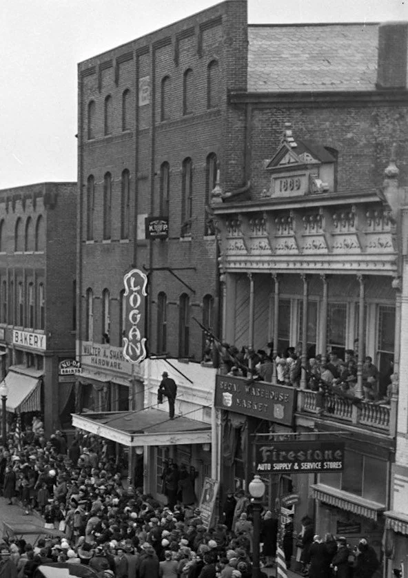
The Logan Theatre, located in the east bay of the Lacy Block in downtown Noblesville from 1932-1957.
At the time, movie theaters were often built as “movie palaces,” meant to transport audiences out of everyday life and into something more immersive, exotic. To create that sense of escape, designers borrowed visual inspiration from a wide range of global architectural styles — including Egyptian, Moorish, and East Asian influences — often grouped together under what was then referred to as “oriental” design.
That influence extended into the lettering itself.
The vertical signs frequently used stylized type with flared strokes, sharp angles, and ornamental details. These letterforms weren’t historically precise to any one culture — they were theatrical interpretations, designed to feel intriguing, dramatic, and otherworldly.
In other words, the typography was part of the spectacle.
In developing the Logan Street Theater identity, there was a clear desire to acknowledge that history — but without directly recreating it.
Rather than borrowing the style outright, the goal was to capture just a hint of its character.
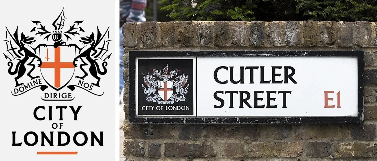
The typeface chosen for LOGAN STREET, Albertus, was designed in the 1930s by German typographer Berthold Wolpe.
Rather than traditional serifs, Albertus uses flared stroke endings — strokes that widen slightly at their tips. Wolpe designed it to resemble letters that had been carved into stone or cast in metal.
For decades, Albertus has been famously used on London street signs, giving it a strong association with place and civic identity. That made it a perfect match for Logan Street Theater.
The flared stroke endings echo the expressive terminals found in historic theater signage, but in a far more restrained and architectural way. Instead of feeling decorative or theatrical in an overt sense, the effect is quiet — something you might notice only after a second look.
It’s a small gesture, but an intentional one.
A way of carrying forward the spirit of those early theaters — the sense of anticipation, of occasion, of being transported — without repeating any misappropriations of the past.
Letting the Word “THEATER” Lead
In the final design, one word gets its own typeface, Sabon, along with the most visual weight:
THEATER
This hierarchy was intentional.
When someone encounters the logo — on a poster, sign, or ticket — the first question should be answered immediately:
What is this place?
The answer should be obvious.
A theater.
Only after that does the eye move upward to identify which theater.
LOGAN STREET.
This emphasis becomes even more pronounced in the horizontal version, where THEATER anchors the composition and ensures immediate legibility from a distance.
A Finishing Touch
The dashed line is one of the more subtle symbolic elements in the design. It serves several purposes simultaneously.
An Homage to Our Street
You can hardly talk about Logan Street without bringing up bricks. The segmented line also subtly suggests the rhythm of the bricks that literally pave the path to our theater.
A Nod to Film
The rhythm of the dashes evokes the cadence of film sprockets and frames — a quiet reference to cinema.
A Foundation of Neighbors
Finally, the line acts as an anchor for the logo, grounding the typography and giving the design a sense of support — almost like a row of audience members gathered under the roof of their neighborhood theater.
Just as importantly, the line helps balance the composition across both logo formats, providing a consistent visual anchor whether the mark is stacked or horizontal.
A Color Palette Inspired by History
The colors were chosen to reinforce the theater’s atmosphere.

Deep Bronze
The primary text color is a very dark bronze rather than pure black. Bronze carries warmth and depth, and historically appears in theater interiors and architectural fixtures.
Brick Red
The accent color — used in the roofline and dashed line — evokes the rich reds often found in bricks, velvet curtains, theater seating, and classic stage design.
Warm Cream
The background color mirrors aged paper, plaster walls, and historic signage.
Together, the palette creates a tone that feels:
historic
warm
theatrical
understated
Your Neighborhood Theater
Logos often try to say too much.
This one tries to say just enough: A peak. A street name. A theater.
A handful of details that quietly connect the building, the neighborhood, and the long tradition of theaters as gathering places.
Many potential elements were explored and ultimately removed, reinforcing the idea that the identity should feel discovered rather than designed.
Ultimately, the identity reflects how we hope the theater will function.
Not as a mysterious arts institution or an event rental facility.
But as your neighborhood theater.
A place where people come together to watch films, hear music, share ideas, and experience stories.
A place rooted in its street.
And in the community that surrounds it.